
I'm Rob, I make ... stuff
What am I up to right now? (ish)
This is my now page, you should make one! What is this?
Latest Projects
I make web stuff and tinker with native apps. Less JavaScript, modern CSS and more mac-assed apps. These are the latest of my projects that I've written up.
About me
I'm a developer interested in making web platforms and services. I'm a Senior Research Software Engineer at Open Lab, a cross-disciplinary HCI research group at Newcastle University. I make technologies for projects ranging from virtual conference schedule's to innovative platforms and even global WhatsApp games.
I play with a lot of technologies and ideas. I'm a keen test driven developer, agile worker and always like to try out different frameworks. For instance I made this site with Eleventy, Nunjucks and a sprinkle of Sass. I'm big into devops, containerising things with Docker and have been quite liking Kubernetes recently.
Most of my projects are on GitHub and my latest ramblings are on Mastodon.
A mini API to get your total App Store downloads
2023
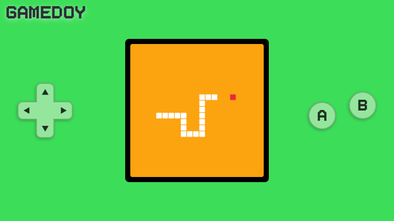
A little fantasy console, kinda like a gameboy, for the web
2023
A curated set of mini services to help Open Lab members
2023
A lightweight web app to view the contents of a container registry
2023
A RESTful API for querying a git repository and commiting changes back
2023
Plugin for Sketch to generate a spritesheet of SVG assets for the web
2023
A self-hosted podcast recorded at Open Lab
2023
A irregular get together to talk about tech with an Eleventy website that hosts the calendar
2023
An end-of-year reflection for Open Lab's CoffeeClub like Spotify Unwrapped
2023

macOS menu app to quickly swap the default browser
2022
MozFest virtual conference
2022

YAML validation and formatting for Nova.app
2022

PDC global virtual conference
2022
A Menu Bar Extras app to quickly get YubiKey OATH codes
2022
A design system for Open Lab research projects
2022
A diary and reminder system for recalling and annotating web interactions
2022
A web extension to hide w3schools search results
2022
Web and server libraries to setup and manage WebRTC experiences
2022
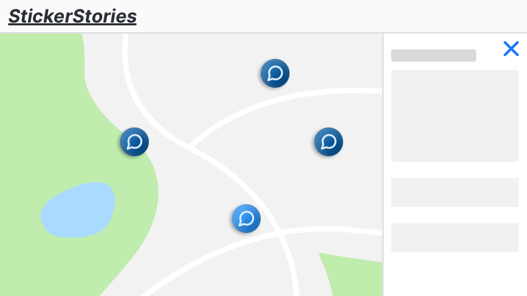
Web engagement platform for anonymous feedback on physical locations using QR codes and A.I. moderation
2022
A local CDN of fonts for Open Lab
2022
Open Source virtual conference platform
2021
Project website for Digital Citizens Centre
2021

Personal utilities for Nova.app
2021

Open Nova projects in GitFox
2021

Prisma syntax highlighting & LSP for Nova.app
2021

XML validation and formatting for Nova.app
2021
Group website and publication aggregator
2021

Virtual climate conference hosted by the Red Cross
2021
Minimalistic macOS menu based pomadoro app
2021
Interactive workshops through the metaphore of a virtual airline journey
2021
A system for fairly buying coffee beans for a shared bean-to-cup machine
2021
36 hour climate conference hosted by the Red Cross
2020
A tool for querying hosting platforms and getting that data into a managable AirTable
2020
Operations dashboard for Open Lab infrastructure
2019
Project-matching app powered by Trello and Google Forms
2019
My personal blog about app, web and iot tech
2019
My personal website and project portfolio
2019
Classroom-based interactive activity dashboard linked to smart bands
2019
Microscopic poll app
2019
Future forcasting game run for Red Cross volunteers
2019
Interview recording, annotation and reporting app
2018
Personal search engine
2018
Trello-powered website and CMS
2018
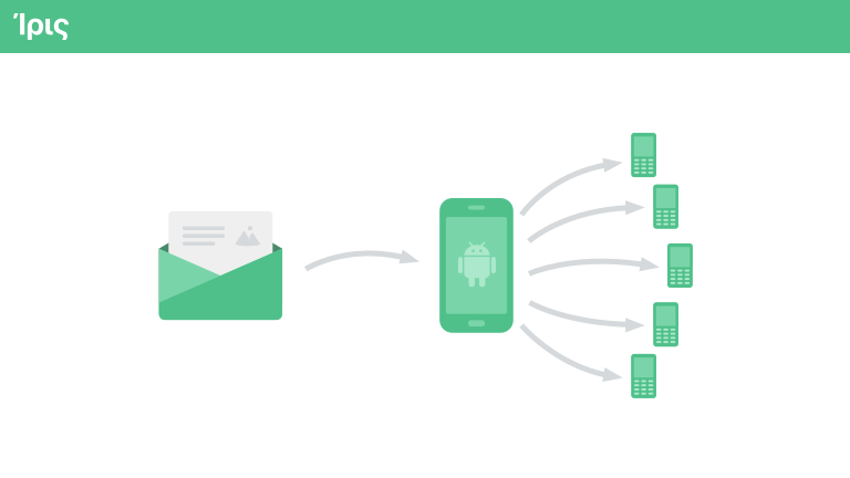
SMS donation platform for Greek solidarity movements
2018
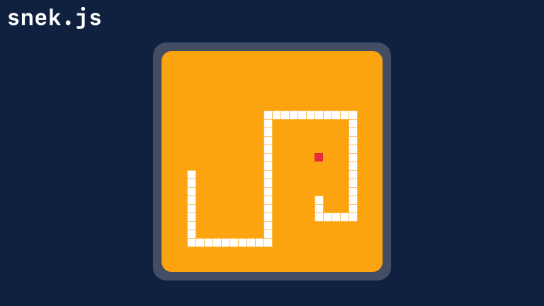
A no-framework web game of snake
2018
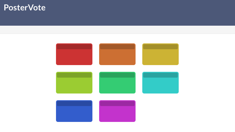
A system for making ordinary posters interactive through flexible circuits and telephony
2018
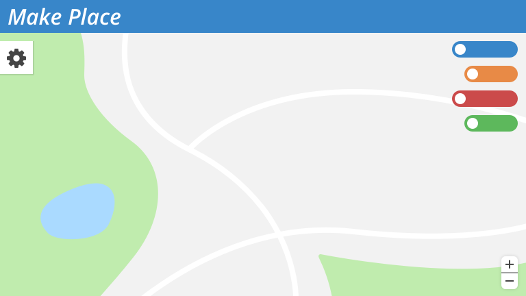
Geograhpical mapping platform
2017
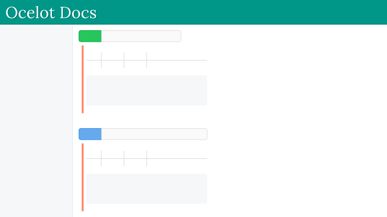
RESTful API docs generator based on YAML definitions
2017
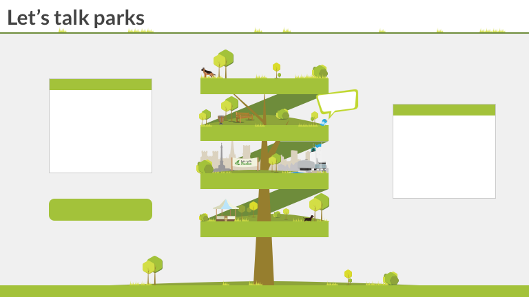
A web engagement consulting on the direction of Newcastle's parks
2017
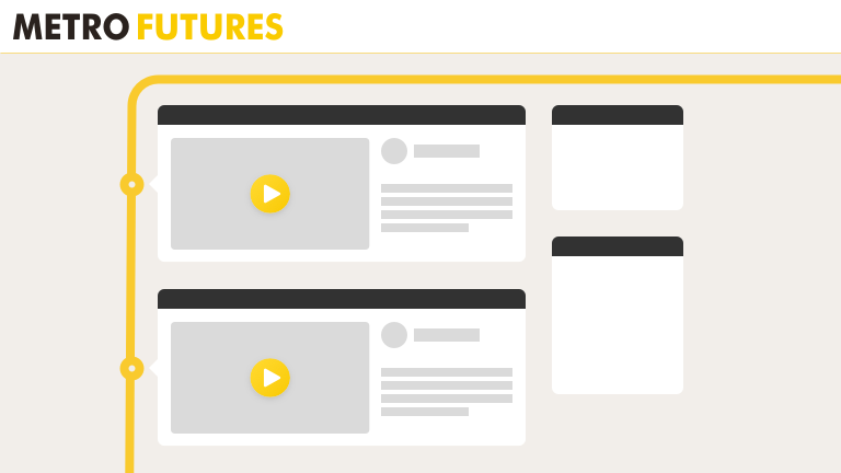
Newcastle metro online consultation
2016
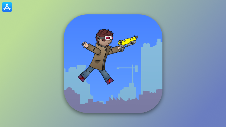
A side-scrolling endless runner game with procedural generation
2015
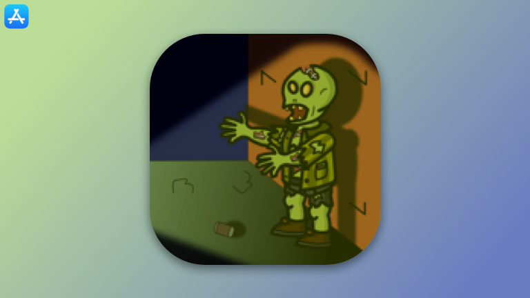
A side-scrolling zombie survival game where illumination is in limited supply
2013